Wednesday, October 15, 2014
Friday, October 3, 2014
DUE MONDAY: 3+DESIGNS/DP UPDATE
You will have a minimum of 3 complete typographical characters/patterns/concepts completed by Friday. If you have more, that is excellent and encouraged.
Some things to remember:
Your designs should take up as much of the whole page as possible (8.5"x11").
You should have heavy areas of silhouette and black as these will read and print better.
Line weights should be consistent throughout each work.
Please consider a public audience in your work.
What else did we discuss during critique?
TO TURN IN, YOU WILL SEND 1 EMAIL WITH THE FOLLOWING:
A:
Save each of your original designs as .AI files as you have been doing all along. We can edit and fine tune these!
Then, SAVE A COPY as a PDF of each work. (pictured below)
This way I can print them off easily for next round of critique.
Your files should be named like this:
LASTNAME.1.pdf, LASTNAME.2.pdf, LASTNAME.3.pdf, etc.
for example: KRAUSE.1.PDF, and so on for all your sweet work.
You can ATTACH them (preferred) or send them as a google doc only.
I will not open or accept files submitted any other way, in any other format, etc...
B:
Take a screen shot of all your work, and post all of these to your DP.
Paste a link into the the body of the email that contains your PDFs you attached.
Again, you will send me 1 email that has both a link to your DP, and the PDF files.
SUBJECT LINE OF EMAIL ONLY (I WILL NOT OPEN ANYTHING ELSE)
3+DESIGNS/DP UPDATE
Send to: jkrause@hightechhigh.org
Wednesday, October 1, 2014
CALL FOR ARTISTS - EL CAJON BLVD PAVEMENT MURAL
$500 dollars for winning design!
SITE FOR MURAL
Art on the BLVD
This is in the shopping center that last years' benches and planter boxes live, and just down the street from where our next bench and planter boxes will live.
Below is the design brief:
Under consideration, a line got chopped off. I believe it should read:
"The Mural design should incorporate no more than 6 different paint colors."
HERE IS THE PDF DESIGN BRIEF
Wednesday, September 24, 2014
MINIMAL DESIGN
There are a lot of different movements and style of graphic design. I am a fan of minimal design, (here, too) and below are a few examples you may want to look at to inform your practice, or to research further. This grew out of Swiss and Mid-Century era design practices:


Tuesday, September 23, 2014
TYPE CHARACTER DESIGN : DRAFT 1
I encourage you to create figurative, abstract, representational, non-representational...whatever strikes you as interesting. you are just playing and tinkering, learning the ins-n'-outs of the program.
Due Friday. beginning of class (so we can do a survey/critique):
3 characters, patterns, designs using the ABCs, 123's and punctation in Illustrator.
Use only 1 font, and keep all the letters and shapes in scale. To make shapes/letter smaller n larger, hold down the SHIFRT key to do so.
Start playing with the Pathfinder, Align, Selection/Direct Selection (the arrows) tools for your creations.
You will print up your 3 designs (1 design per sheet of paper. Your design should take up the entire 8.5x11 page)
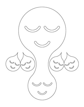
below are a few selections from last year's student work:


3 characters, patterns, designs using the ABCs, 123's and punctation in Illustrator.
Use only 1 font, and keep all the letters and shapes in scale. To make shapes/letter smaller n larger, hold down the SHIFRT key to do so.
Start playing with the Pathfinder, Align, Selection/Direct Selection (the arrows) tools for your creations.
You will print up your 3 designs (1 design per sheet of paper. Your design should take up the entire 8.5x11 page)
below are a few selections from last year's student work:

LEONARD BASKIN
Leonard Baskin makes minimal but expressive works in a variety of media.
What are some similarities and differences of his work (especially the line quality) and Barry McGee/Margaret Kilgallen?

What are some similarities and differences of his work (especially the line quality) and Barry McGee/Margaret Kilgallen?
Subscribe to:
Comments (Atom)